Optimized Checkout Flow
Fitbit needed to optimize their checkout process to improve the user experience and increase conversion rates. To prioritize a seamless checkout experience, I minimized form fields, offered clear progress indicators, and provided multiple payment options.
- Strategy
- UX Research
- UX Design
- Design Leadership
- Prototyping
Solution Approach
To a certain extent, there is simply a right way to handle much of this process. To build a best-in-class checkout experience the designs should be simple, efficient, and focused.
Where the experience went above and beyond, especially compared to Amazon, is in the purchase confirmation experience. This is where we can welcome people to the Fitbit Nation, introduce the ecosystem, and continue to build that long-term relationship even before customers have the product.
Outline e-commerce best practices for checkout flows
- Incorporate a cart (which was not present in the existing experience)
- Make smart recommendations based on user behavior
- Streamline with a single page (existing checkout experience was stretched across 6 pages)
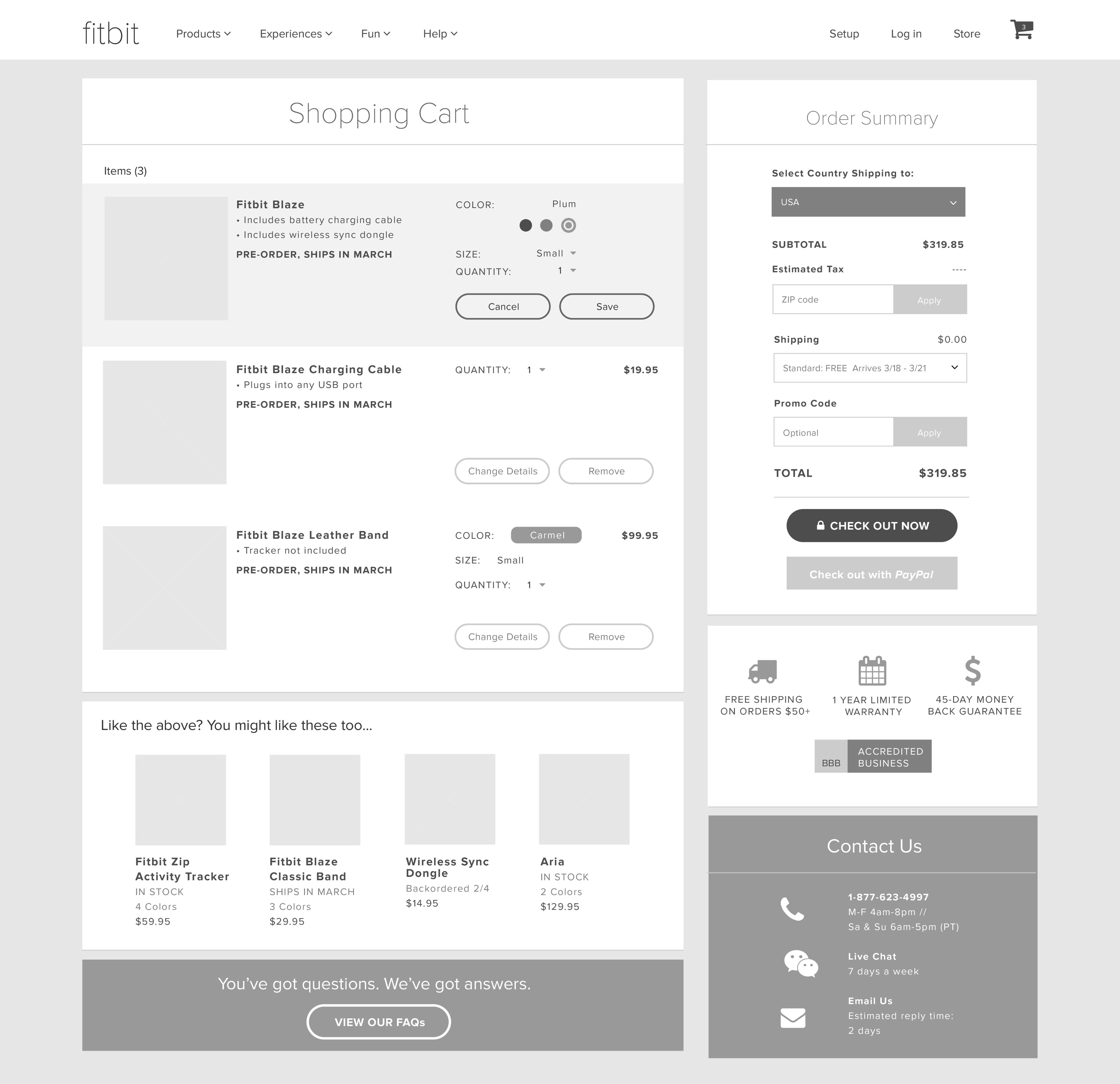
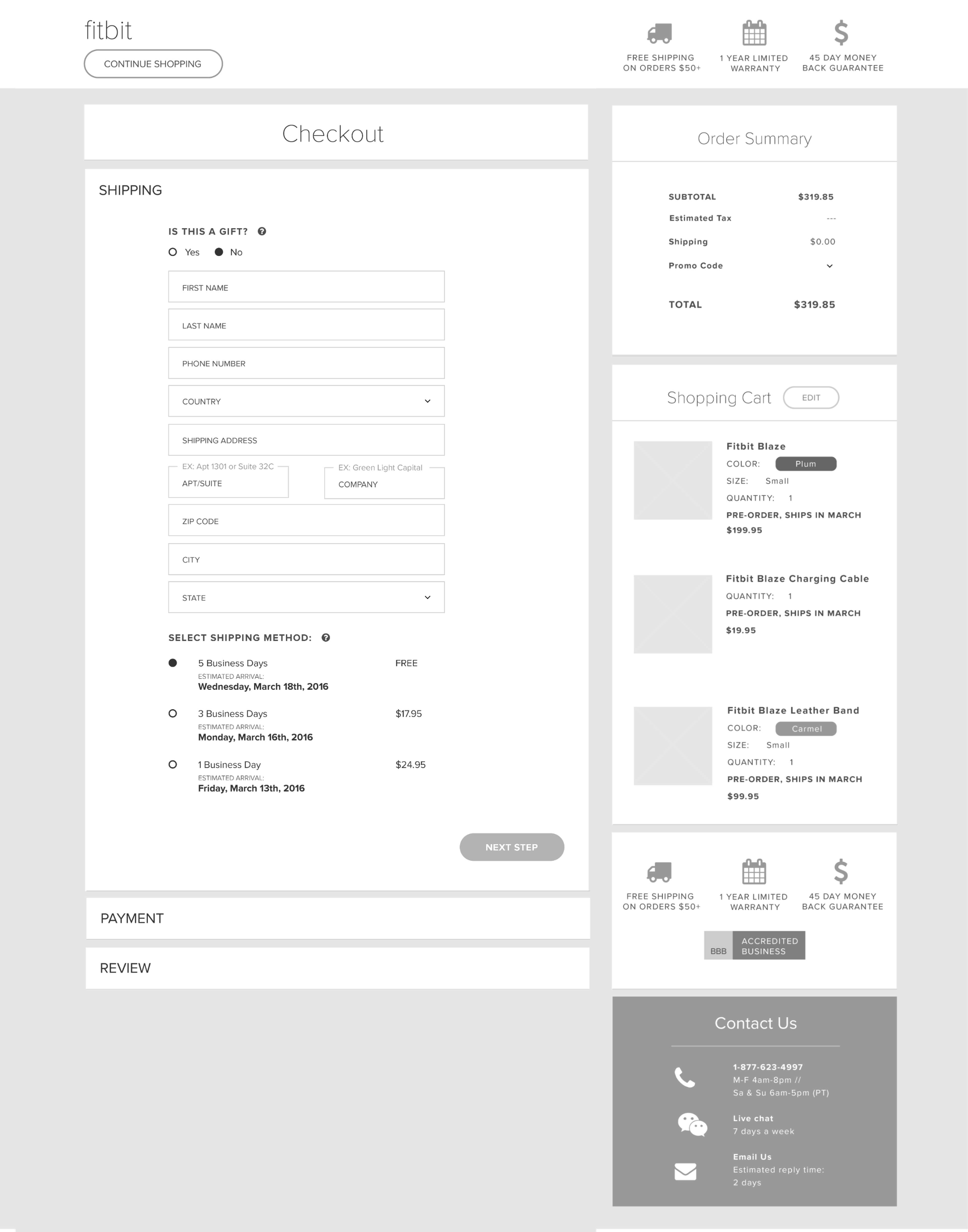
Wireframes
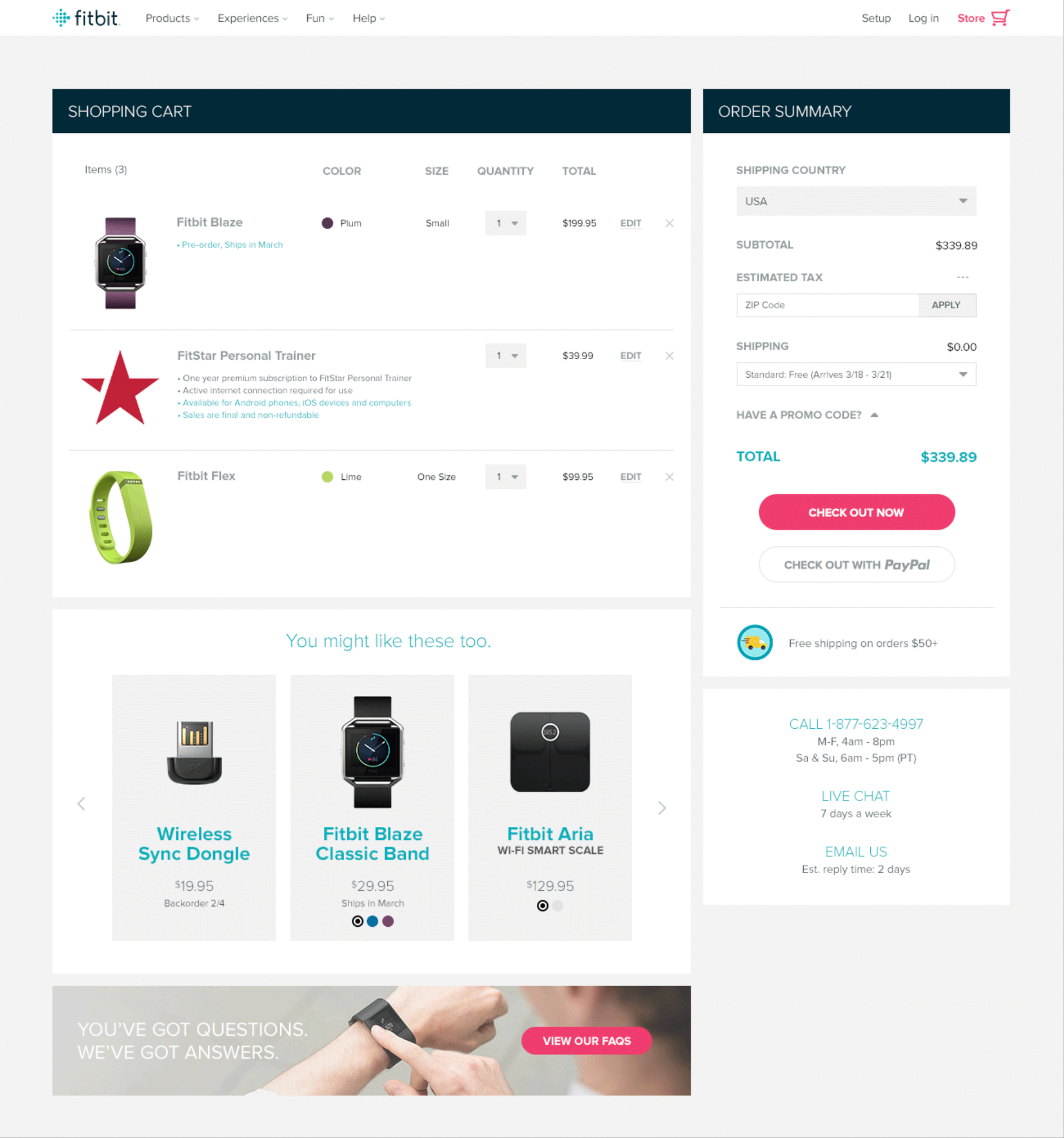
Shopping Cart
New shopping cart provides an opportunity to cross-sell outside of the purchasing flow. The new page includes functionality that allows a user to add promo and zip codes to get an accurate quote.
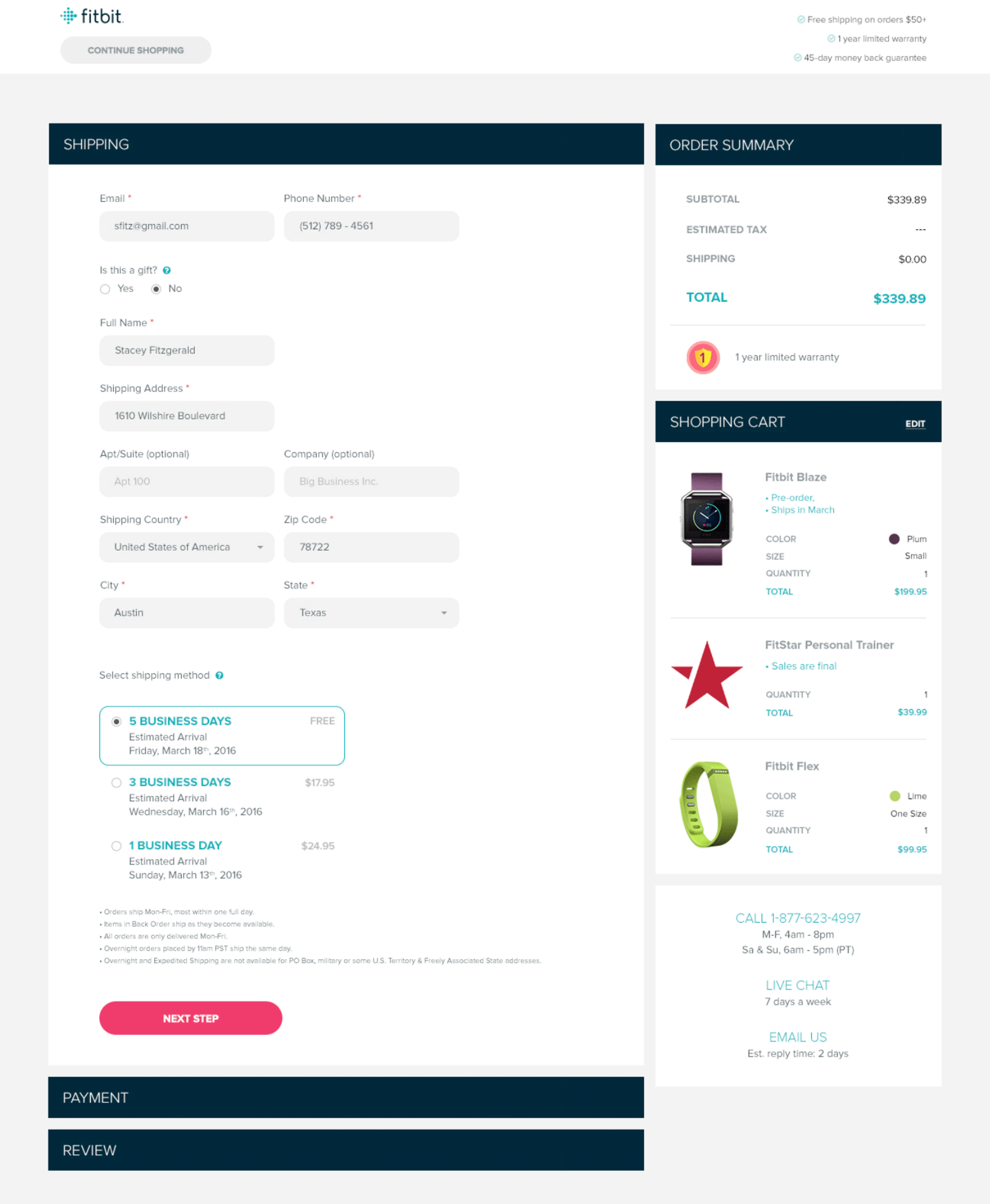
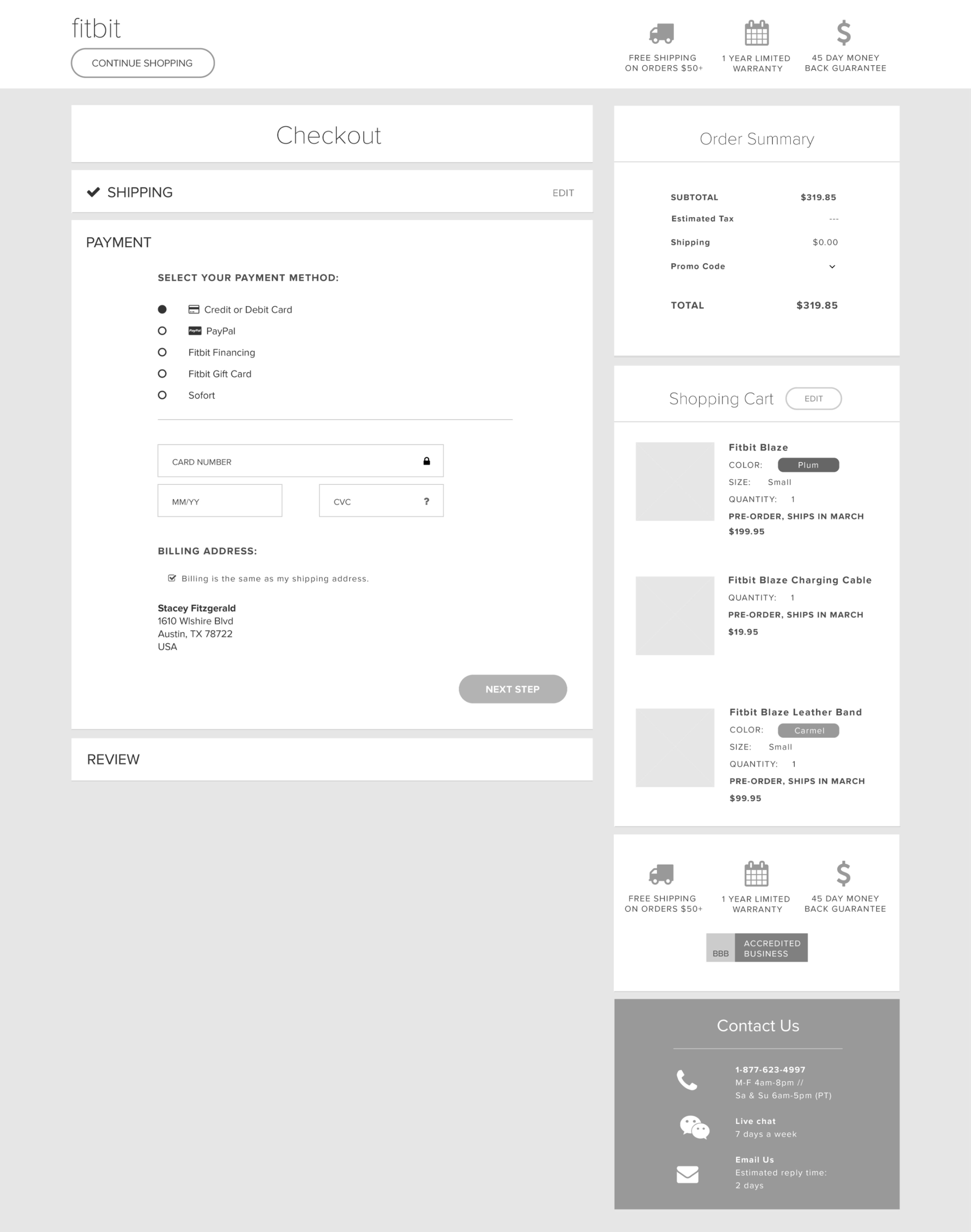
Shipping and Payment Pages
Single page with modular structure that allows Fitbit to easily add and remove content without breaking the design.
Accordion style checkouts scored 19.2% better in the checkout usability compared to their traditional counterparts.
A shopping cart summary was added to the payment flow to help users feel confident with their purchase without having the leave the flow. Inline validations were also added to give the user feedback when they have successfully or incorrectly completed a section.
Persistent basket summary reminds users of their baskets and the total order cost without having to leave the checkout.
Final Design Comps