In-store Kiosk Experience
More and more, kiosks are increasingly becoming a core part of omni-channel experience for customers visiting the store. An Android kiosk product is critical to enhancing the customer experience in terms of UX, UI and solving highly desired customer problems. The challenge is the kiosk should enable customers to self serve or get assisted by associates to find and shop for products they need.
- UX Research
- UX Design
Solution Approach
Stakeholder Interviews
Through conversations with the stakeholders and development team, I was able to compile a list of goals that the kiosk needed to accomplish:
- Serve for quick transactions but also act as an exploration and sales tool
- Fresh design that’s inviting and touch-friendly
- Faster experience throughout entire process
- Interacts with other devices (network printers, scanners etc.)
- Is secure for customer
- Reduces number of levels to complete a use case/need
Ethnographic Research
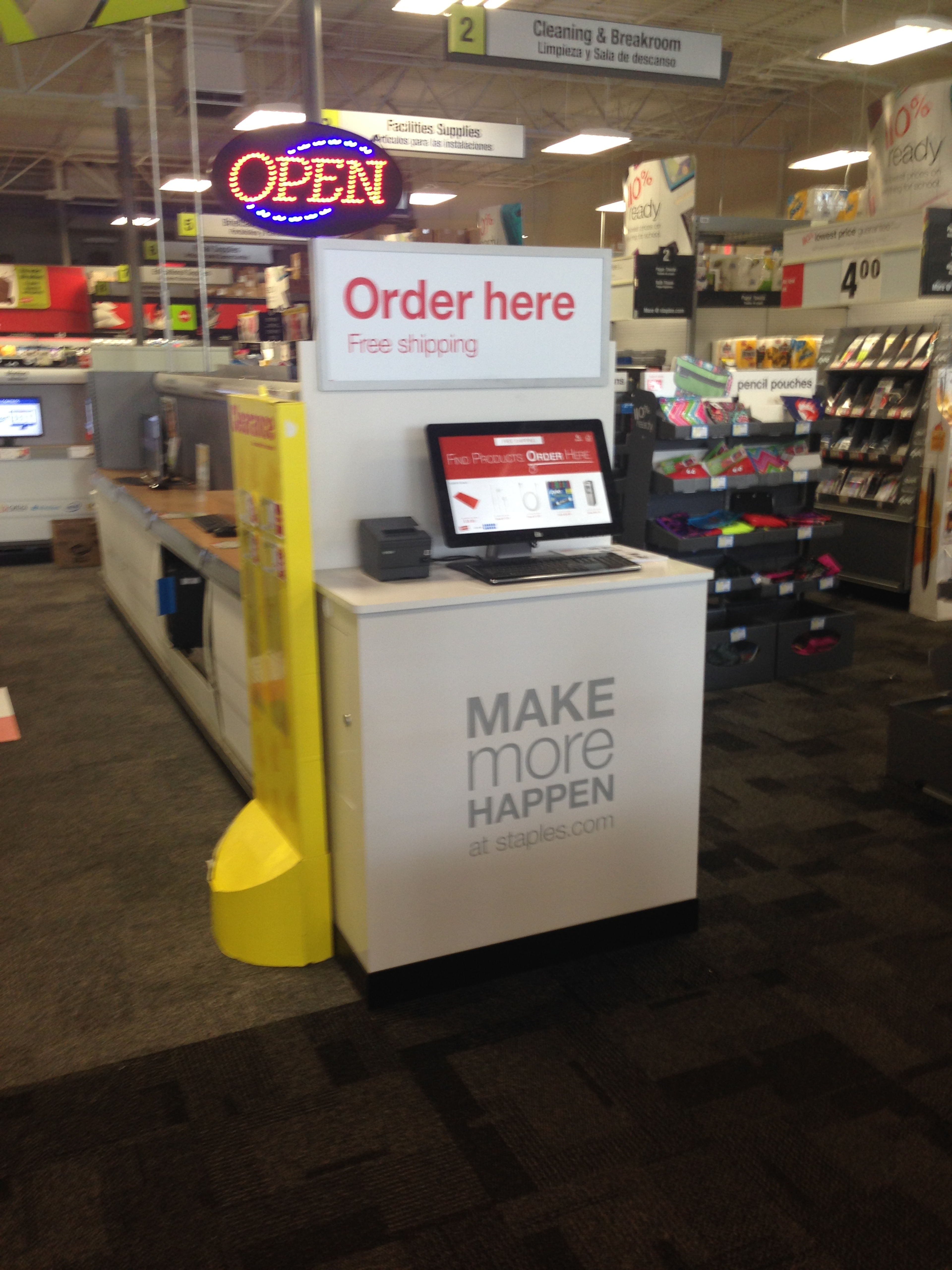
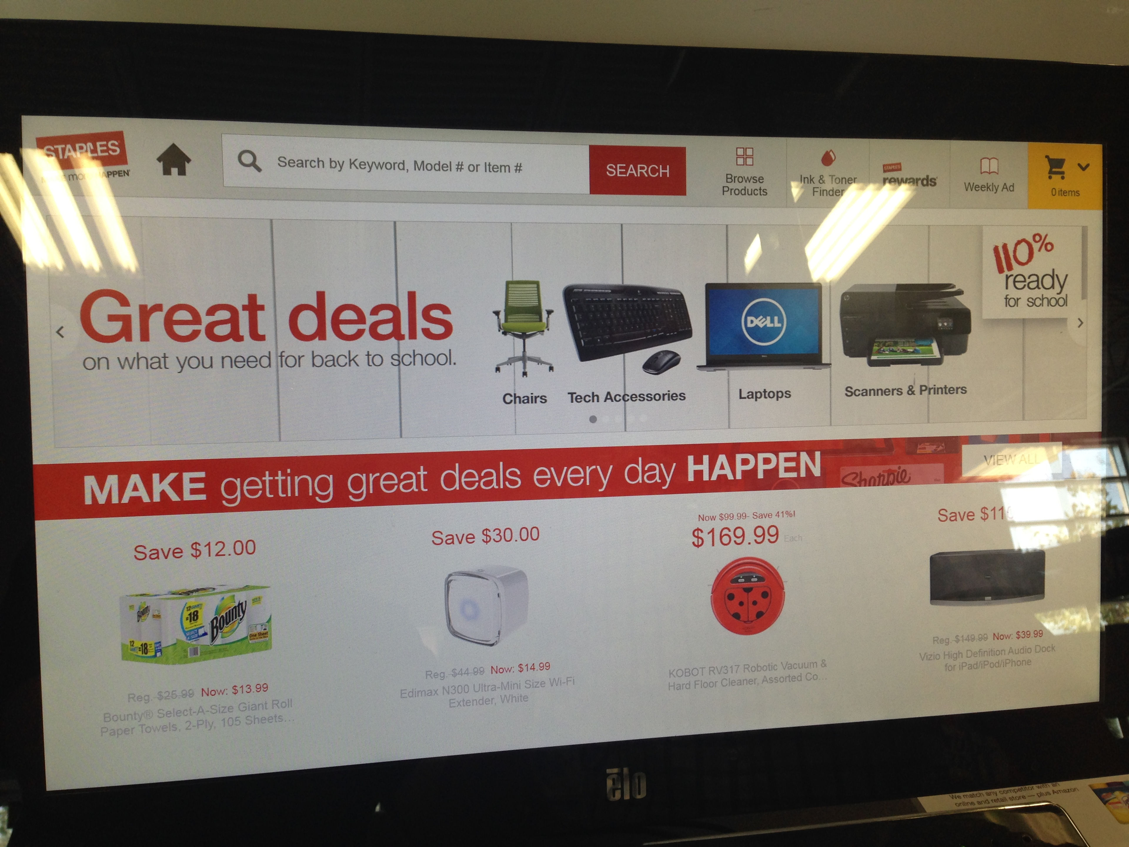
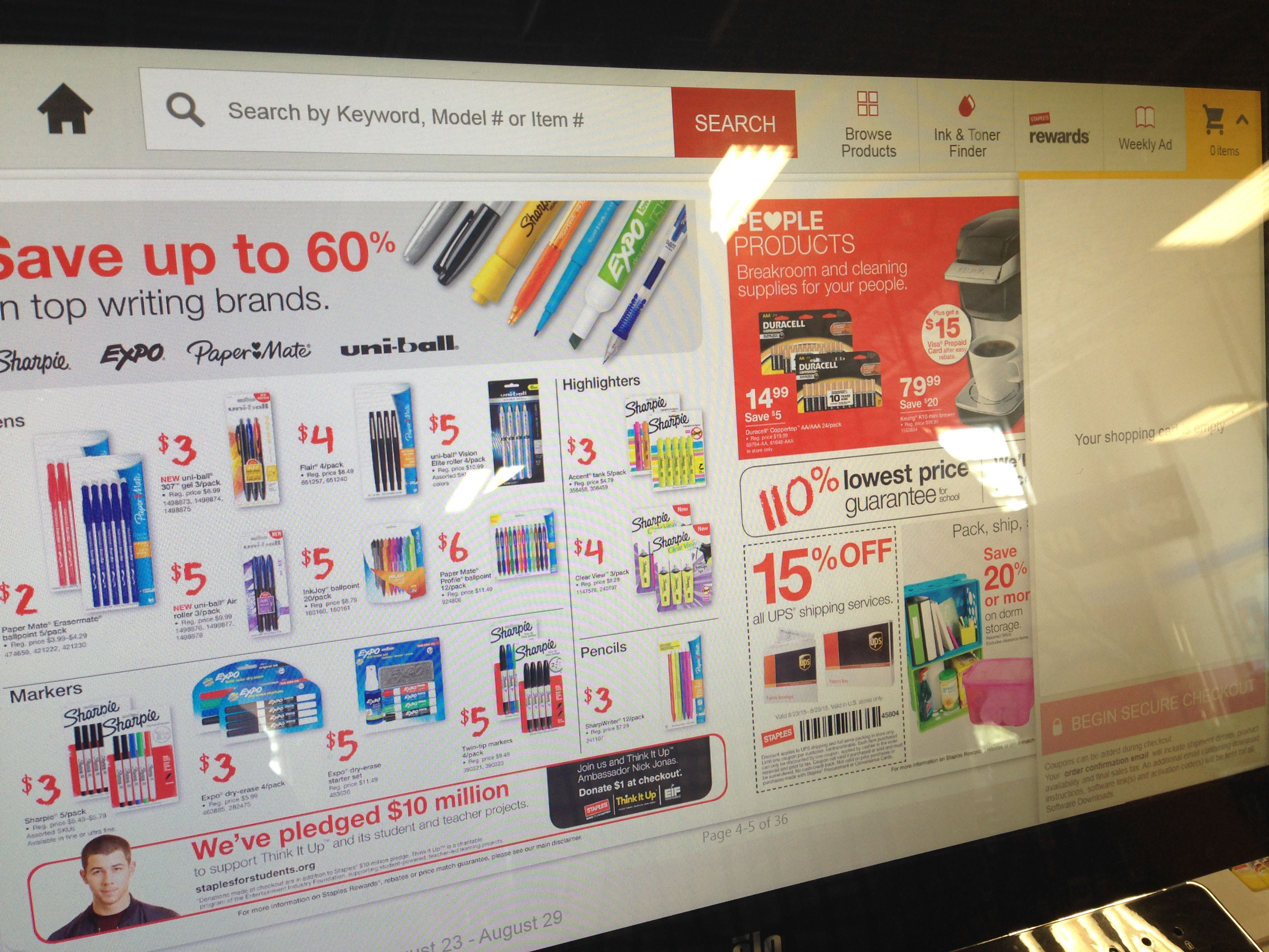
The team visited a local Staples to see how customers and sales associates were interacting with the current kiosk. One of the major findings was that most customers were not aware that there was a kiosk in the store due to poor positioning and insufficient signage.
Top Research Findings
- When the kiosk was brought to the attention of customers, many thought that it was for employee use only.
- Associates walked me through the process of finding a product and noted unnecessary pages that slowed them down.
- The associates also expressed a desire to have a shortcut to the search process.
Kiosk Design
Wireframes
The design focuses on simplicity, speed and helpfulness, guiding customers and associates to what they’re looking for. The new design is optimized for a kiosk, allowing customers to:
- Make the kiosk helpful from first glance.
- Simplify tasks. Provide intuitive steps.
- Encourage touching and tapping. Big buttons. Big search fields.
- Make navigation consistent with clear way-finding and content hierarchies.
- Give everything a purpose. Cut extra images and content.
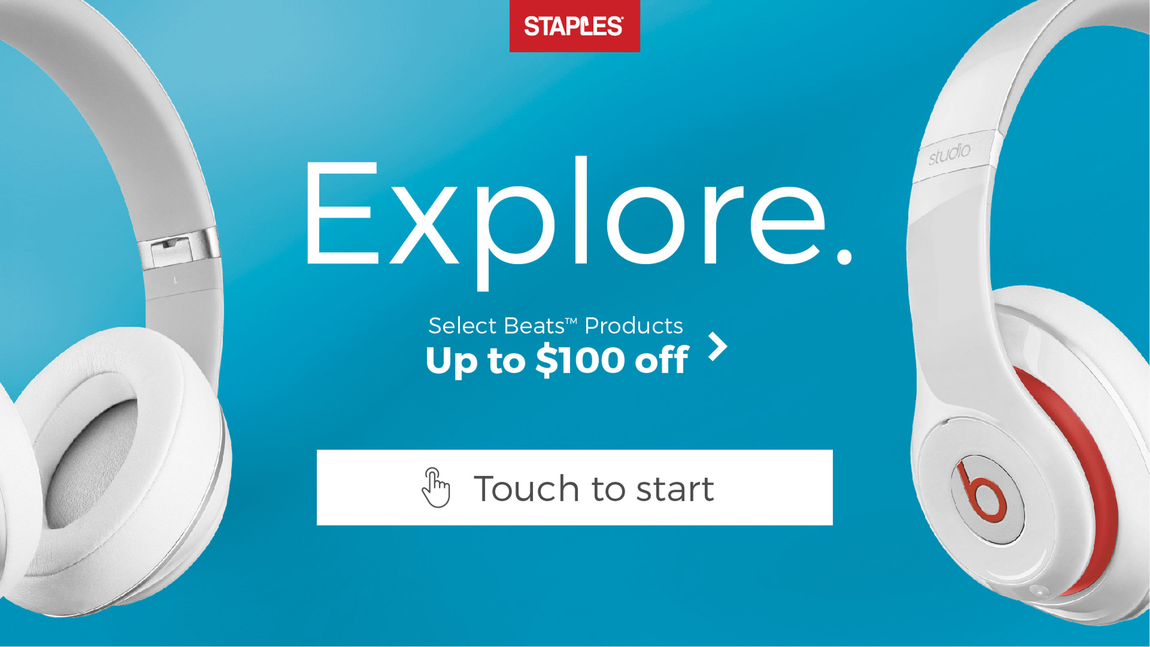
Landing and Search Pages
Bold, eye-catching design that attracts customers and leads with a way to fulfill their main goal of searching for a product. Menu is minimized but always available.
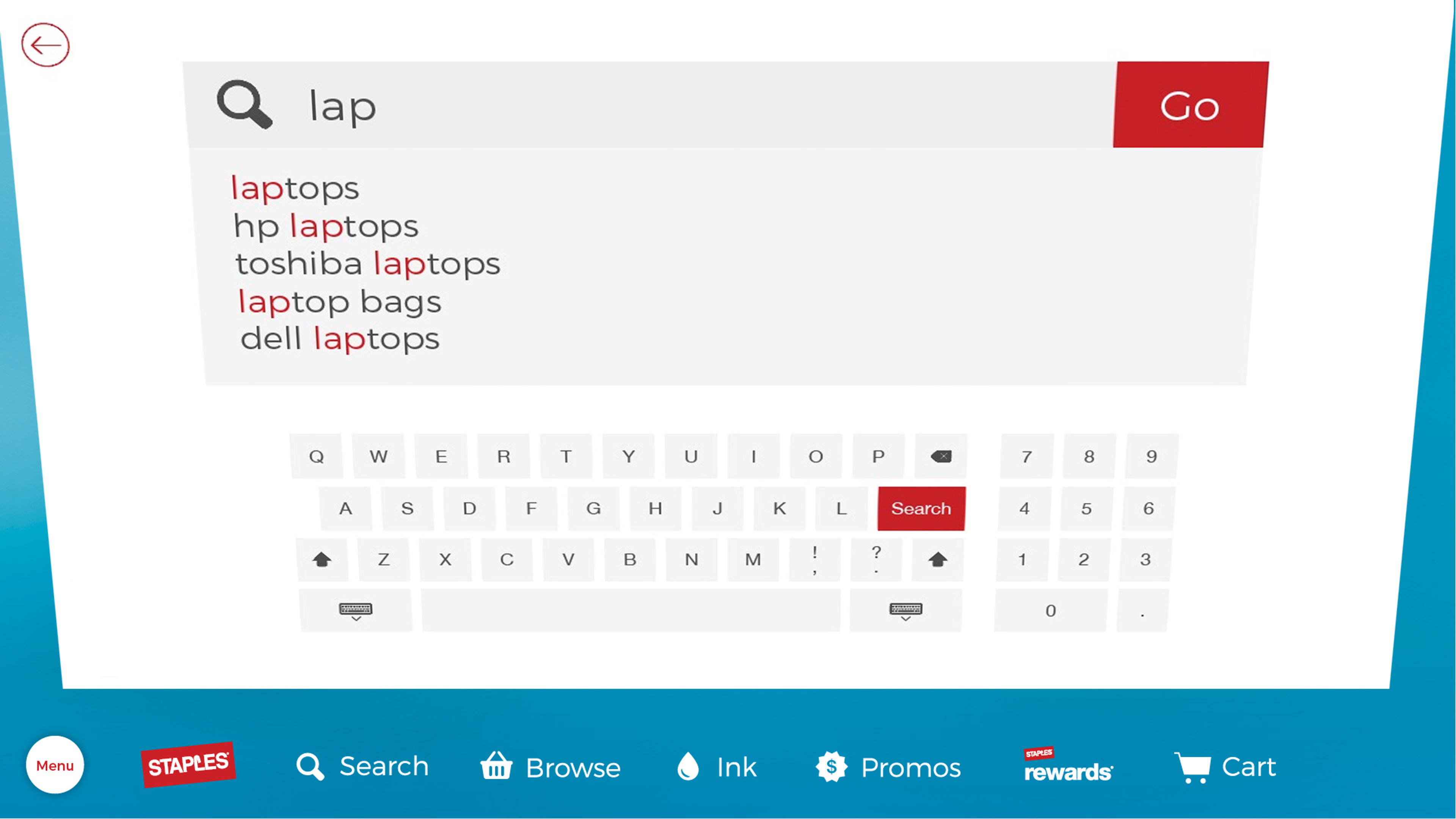
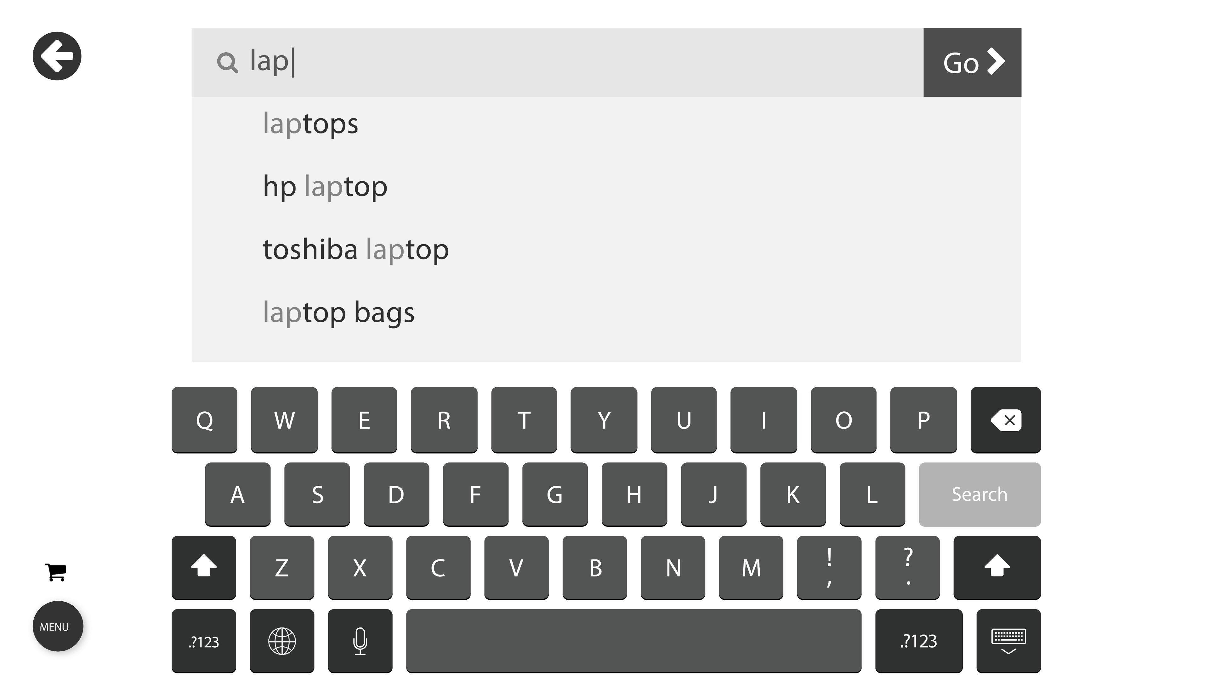
The search page is simplified and enhanced using predictive text and removing all unrelated content.
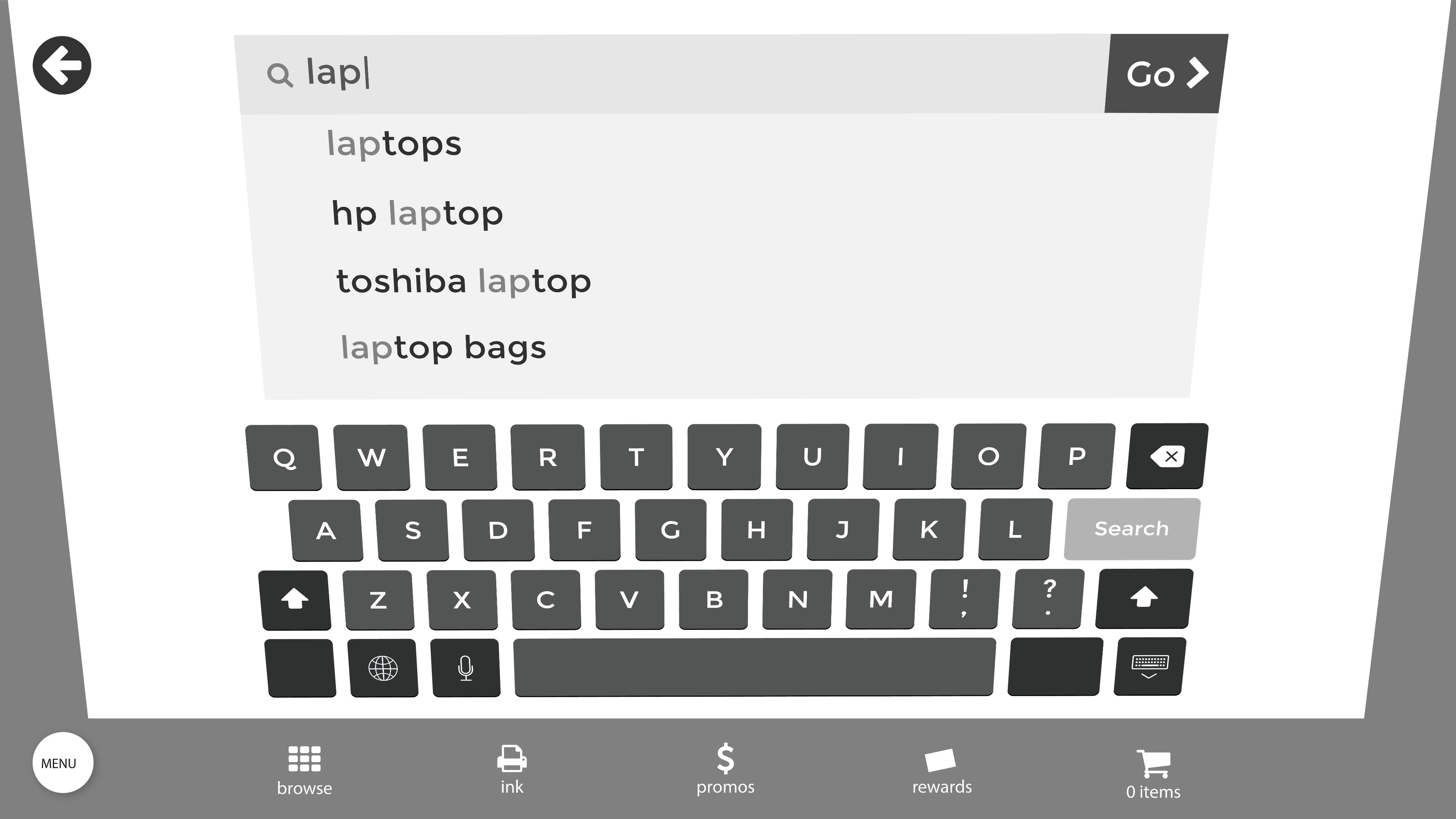
Menu and Results Page
Utilizing material design, menu swings back from bottom and closes with a tap of the menu icon.
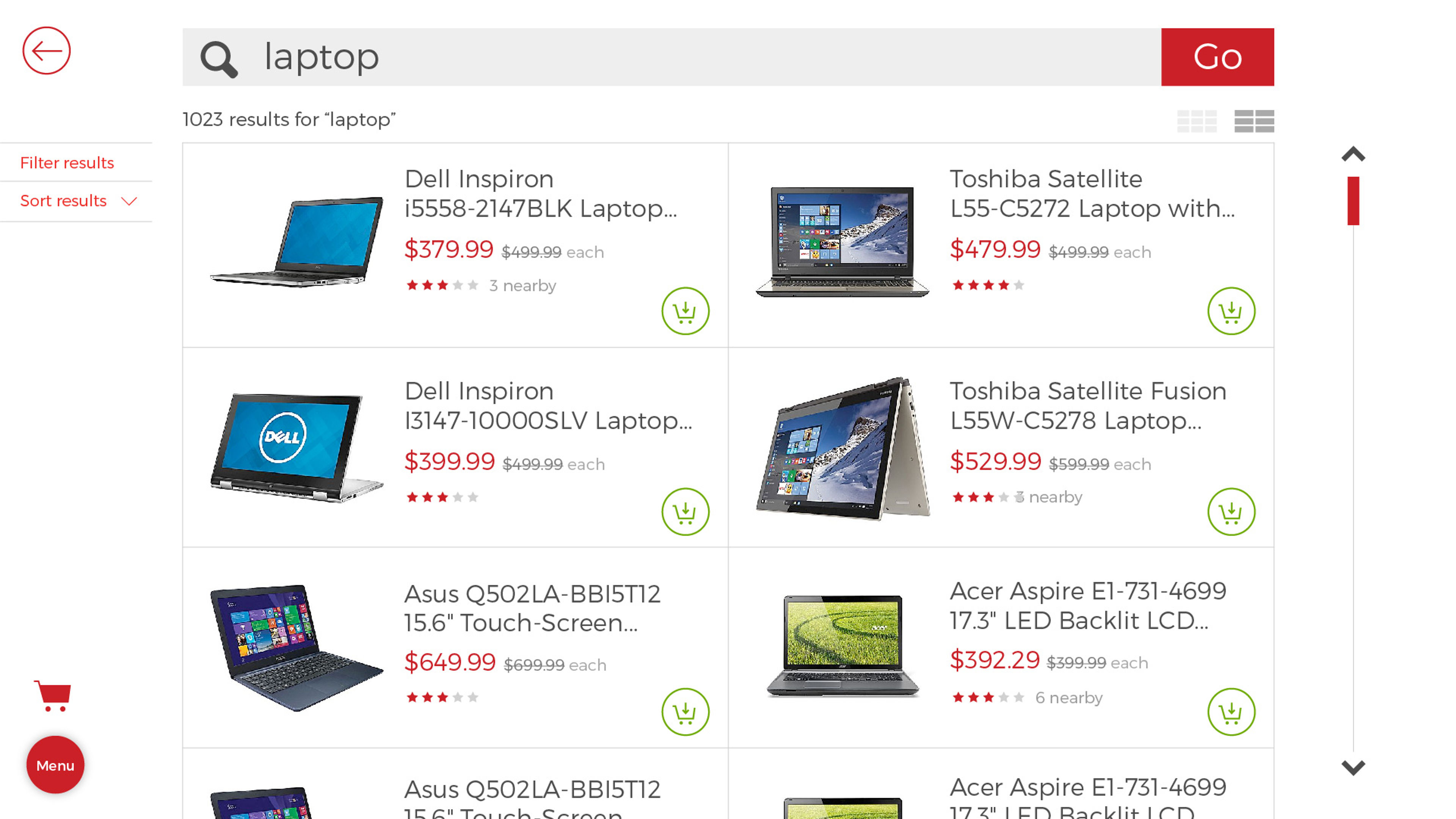
To improve readability, products are given ample space with large, simple buttons. Results are limited with the option to view more by scrolling.
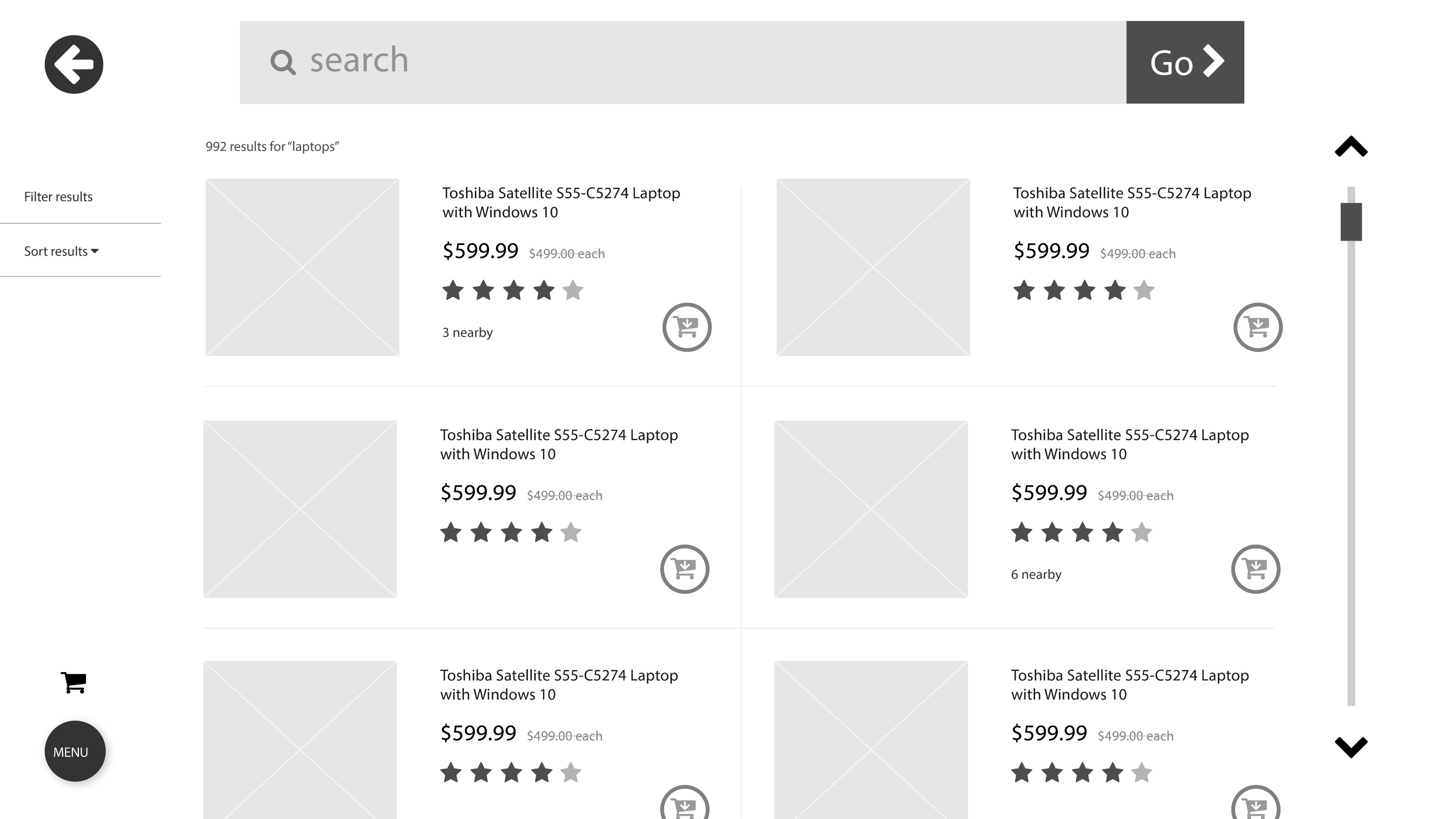
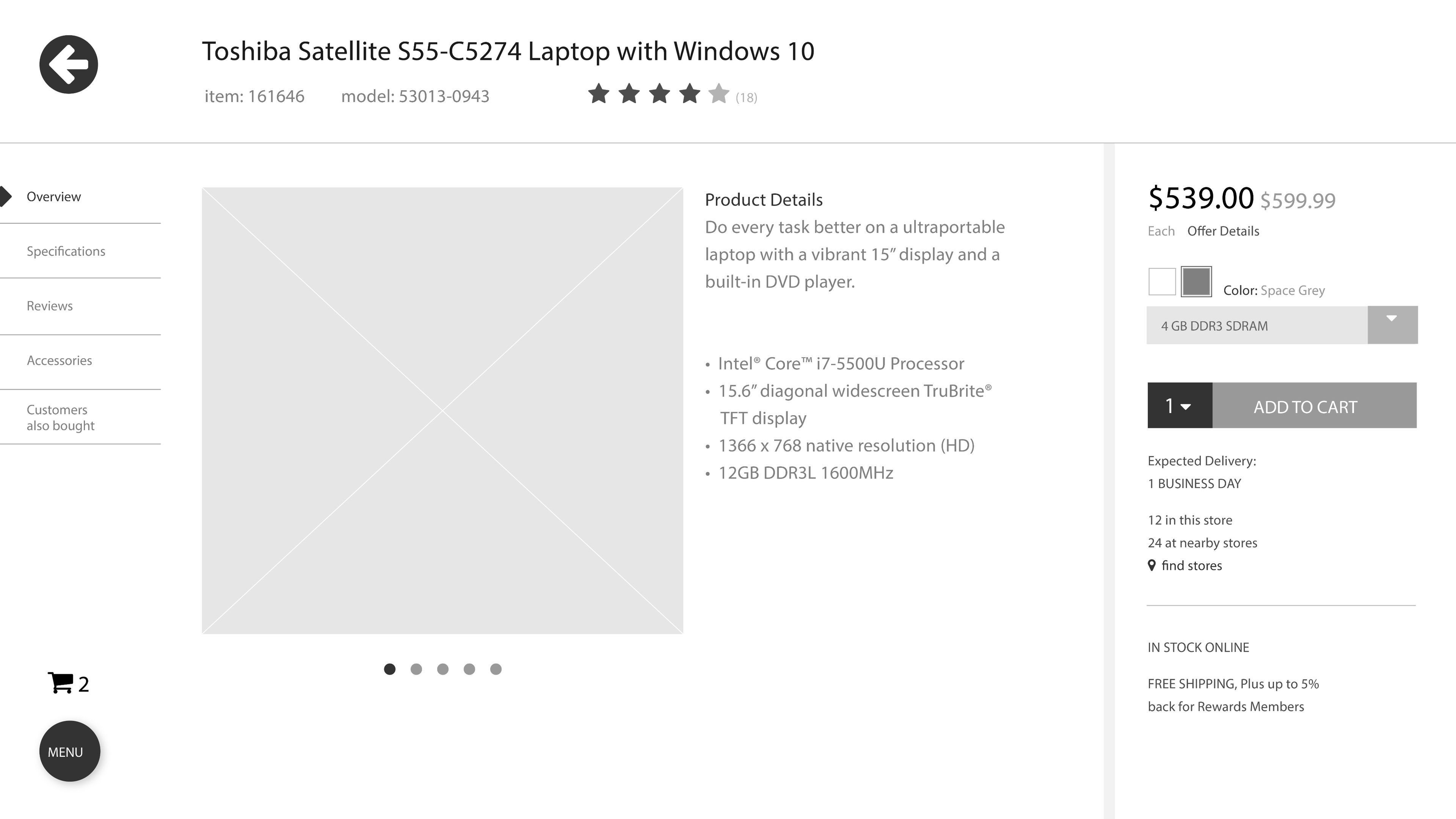
Filtering and Product Page
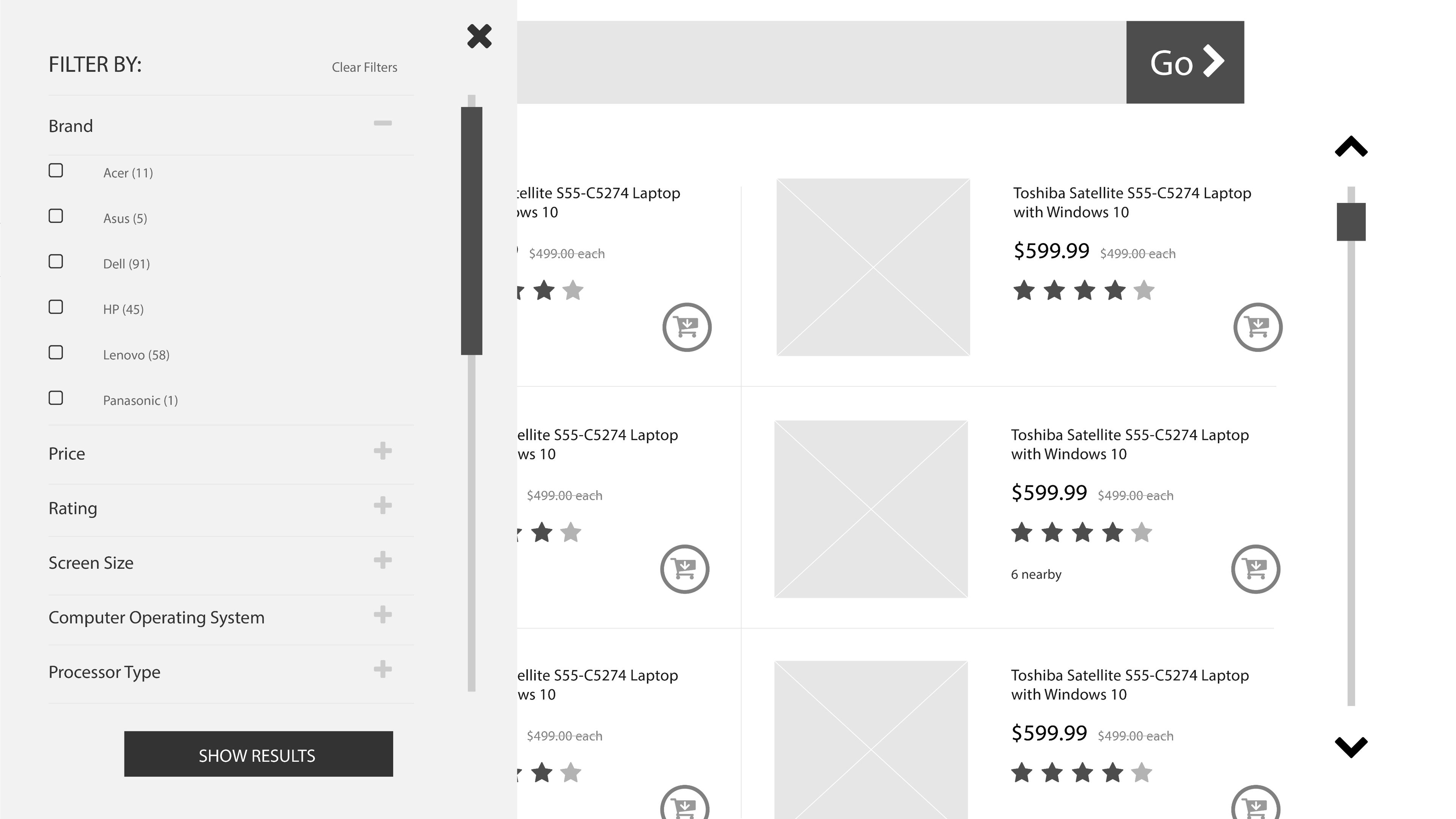
User can access filtering option from left rail and sort results. Filters are revealed only when needed/tapped.
Tabs are used to group and organize the details about a product, while also keeping the page clean and easy to scan. Right bar is devoted to purchasing the product.
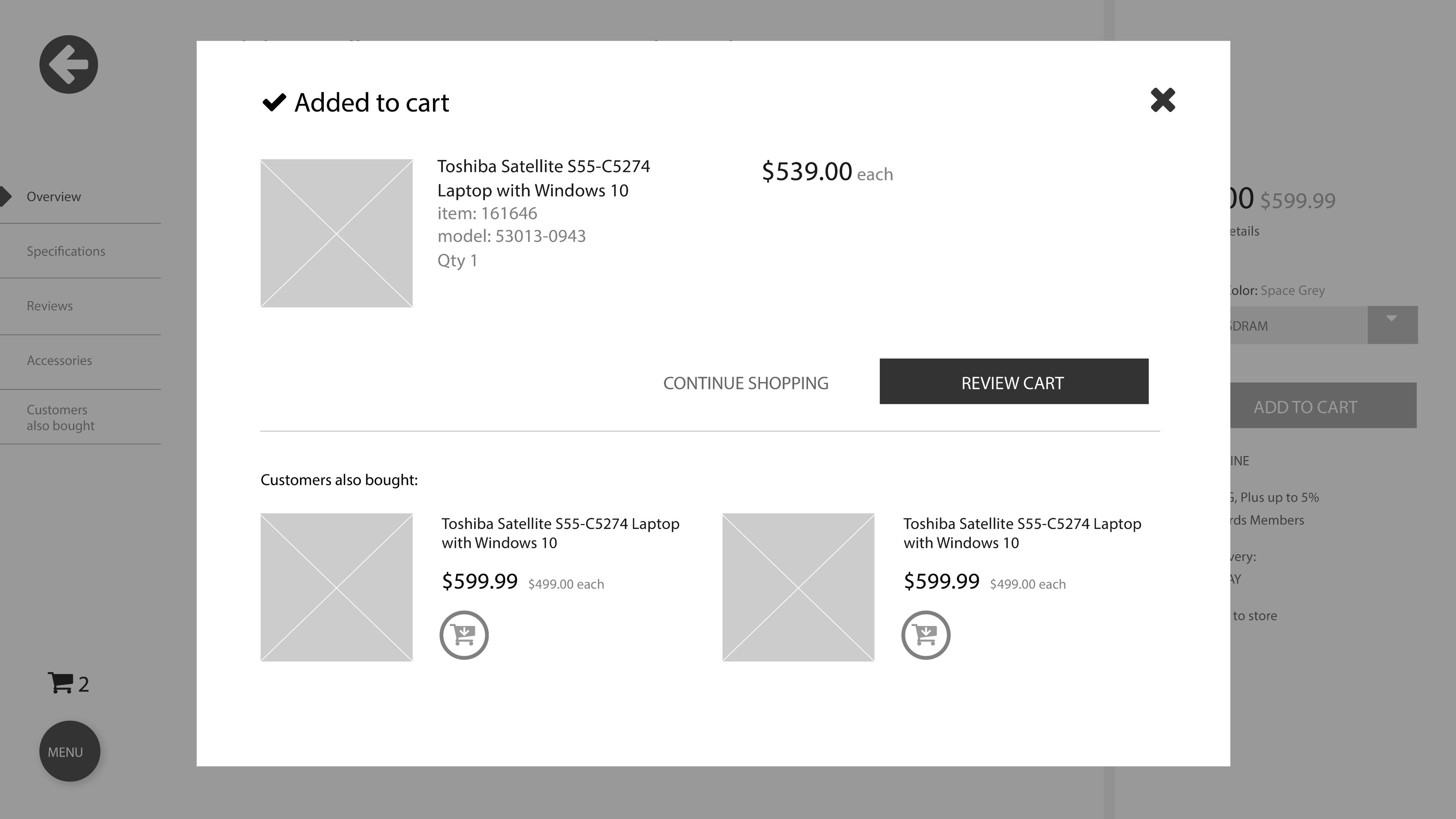
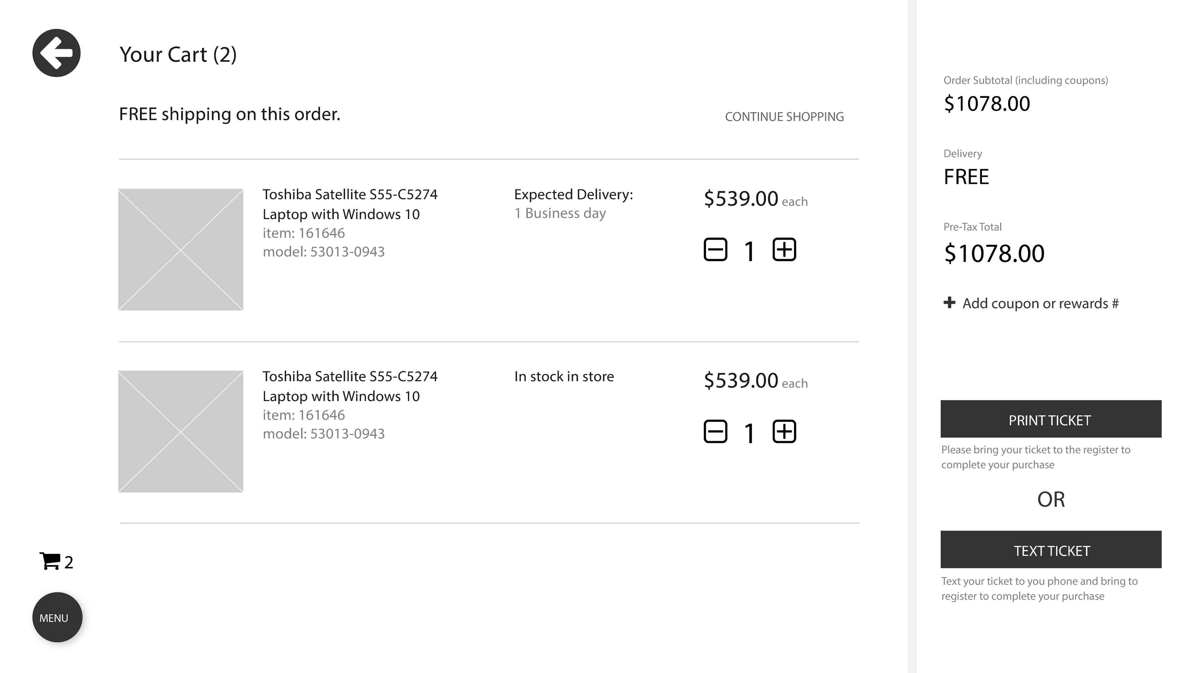
Added to Cart and Cart Page
Once a user has added an item to their cart, a modal will appear that promotes products for cross-selling.
From the cart the user has two options to complete their purchase: print a ticket to take to the cashier, or text the ticket to their phone to have the cashier scan.
Design Comps
Partnering closely with the design team, my wireframes were used as the design blueprint for the high-fidelity comps.